
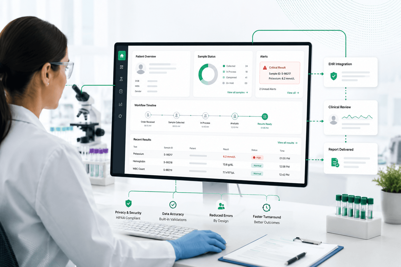
UX Design for Lab and Clinical Workflow Software: What Works Best
Why does clinical software feel harder to use than the ATM at your bank? The most recent industry-wide benchmark puts a number on it. The KLAS Arch Collaborative, drawing on more than 53,000 physician responses, found in December 2025 that the average physician's EHR experience score sits at 23.4 on a scale that runs from -100 to +100. Only 18% of physicians report a strong or elite experience with their system (KLAS Arch Collaborative, December 2025). A separate, peer-reviewed 2024 study of over 2,000 family physicians found the same pattern holds specialty by specialty: EHR usability tracks directly with satisfaction and burnout (Holmgren et al., JAMA Network Open, 2024). This article covers what actually works when designing lab and clinical workflow software for US healthcare teams, what consistently fails, and how to build interfaces that clinicians, lab technicians, and scientists will actually adopt, not just tolerate.
Key Takeaways
- The average physician EHR experience score is 23.4 out of a possible 100, and only 18% of physicians report a strong or elite experience with their system (KLAS Arch Collaborative, December 2025)
- A 2024 study of over 2,000 family physicians confirmed that EHR usability is directly associated with satisfaction and burnout, holding true across specialties (Holmgren et al., JAMA Network Open, 2024)
- Physicians spend roughly 13 hours a week on indirect patient care tasks like documentation and order entry, and each additional hour of after-hours EHR work is linked to higher burnout risk (KLAS Arch Collaborative, 2025)
- Clinicians still override the vast majority of clinical decision support alerts, including many flagged as critical, a pattern AHRQ's patient safety network confirmed as current in its most recent 2024 review (AHRQ PSNet, Alert Fatigue, last reviewed 2024); a 2026 systematic review found the field still has no standardized way to even measure this problem, which is itself part of why it hasn't been solved (JAMIA, 2026)
- For AI-enabled clinical software specifically, FDA's January 2025 draft guidance adds new usability requirements around cognitive load assessment, transparency testing, and documenting how clinicians override the system's suggestions (FDA draft guidance, January 2025, via MedDeviceGuide)
Why Is UX for Lab and Clinical Software Different?
Most consumer UX advice doesn't really apply here, and following it anyway is a big part of why clinical software keeps landing at the bottom of every usability benchmark that measures it.
The users are experts, not first-time visitors. A lab technician runs the same workflow hundreds of times a day. They don't need hand-holding. They need speed, density, and the ability to fly through a task without the interface slowing them down. Lab software built around generic clinical templates rarely respects that rhythm. The stakes are also high, and the work is safety-critical: a misread sample ID or a buried abnormal result isn't a bad user experience; it's a potential patient-safety event.
On top of that, the environment is hostile to focus. Clinicians and lab staff work amid constant interruptions, shared workstations, gloves, gowns, and screen glare, not a quiet desk. And in the US specifically, the work is regulated under HIPAA and, for medical device software, FDA human factors requirements, so the interface has to support traceability and accreditation, not just feel pleasant to use.
In that setting, the scarce resource is expert attention. The job of the design is to protect it.
What Works Best: UX Design Principles for Lab and Clinical Software
The patterns that succeed in this domain all share one trait: they treat the user as a capable expert and get out of the way.
| Principle | What It Looks Like in Practice |
|---|---|
| Design for the expert, not the novice | Keyboard shortcuts, dense information views, smart defaults, minimal forced steps |
| Cut clicks and cognitive load | The shortest path through a task; no re-entering data the system already has |
| Make the critical glanceable | Clear visual hierarchy; abnormal results, sample status, and patient identity surfaced first |
| Signal over noise on alerts | Few, specific, actionable alerts, tiered by severity, never a wall of pop-ups |
| Fit the real workflow | Designed around how the lab or clinic actually works, including handoffs and interruptions |
| Prevent errors by design | Confirmation on irreversible actions, unambiguous identity, easy undo |
| Accessible and environment-aware | WCAG compliance, legibility under glare, usable with gloves and shared logins |
| Surface data in context | Results delivered into the clinician's existing EHR view, not a separate login |
Three of these carry the most weight. Cutting cognitive load is the heart of it, because every unnecessary click and every re-keyed field is expert time taken away from patients or science. Taming alerts is close behind: AHRQ's current review of the evidence confirms clinicians still override the vast majority of alerts they're shown, critical ones included, and a 2026 systematic review found the research community still hasn't settled on a consistent way to even define or measure alert fatigue (AHRQ PSNet, 2024; JAMIA, 2026).
An interface that interrupts an expert with low-value warnings teaches them to ignore the system entirely, which is dangerous. And fitting the real workflow matters because software built around an idealized process, instead of the messy, interrupted reality of a US lab, forces staff to work around it, and that's exactly where errors and frustration come from.
What Fails: Common UX Anti-Patterns in Lab and Clinical Software
The failures are just as consistent as the successes.
- Research tools repurposed for clinical use. One of the most common lab software failures in production settings. Research interfaces are built for flexibility; clinical work needs speed, safety, and the same result every time, and those two goals pull in different directions.
- Consumer patterns imposed on experts. Oversized buttons, step-by-step wizards, forms that force one field at a time, all of it slows down someone who runs this exact task all day.
- Too many alerts firing for things that don't matter. This teaches people to stop reading any of them, including the ones that do matter.
- Hidden state. When a sample's or an order's status isn't clear, people stop trusting the system and start double-checking everything by hand, which defeats the purpose of having the software at all.
- Software that needs days of onboarding to use. This usually isn't a training problem. It's a sign that the hard part of the design got skipped, and the burden got handed to the user instead.
How to Design Lab and Clinical Software Well
Good UX in this domain isn't guesswork; it's learned from the people doing the work, which also happens to be the most respectful way to build it.
Start with contextual research. Watch lab technicians, clinicians, and scientists do their actual jobs, in their actual environment, before designing anything. The real workflow, with its interruptions and handoffs, is never the one on the process diagram. Test with real users, not stand-ins: usability testing with the clinicians and lab staff who'll actually live in the software surfaces problems no internal review ever will. Iterate because the first design is a hypothesis, not a finished product.
For software that meets the FDA's definition of a medical device, this part isn't optional. IEC 62366-1:2015 and the FDA's 2016 human factors guidance require a structured usability engineering process aimed at eliminating use-related risk, built on iterative evaluation with representative users. If the software has any AI-driven decision support component, FDA's January 2025 draft guidance goes further, adding specific requirements for testing how much cognitive load the AI output places on the clinician, how transparent the system is about its own confidence, and documenting exactly how and when clinicians override its suggestions (FDA, January 2025 draft guidance). And design for accessibility from the start, to WCAG standards, because US clinical teams are diverse and the environment doesn't make it easy.
This is the work NonStop does for lab and clinical software teams in the US, designing for adoption rather than for a demo. NonStop builds clinician- and scientist-facing interfaces, from genomics LIMS and clinical workflow platforms purpose-designed for how labs actually work rather than repurposed from generic tools, to provider and patient portals that surface results inside the clinician's existing EHR view.
Its healthcare product and UX practice pair WCAG-compliant, accessibility-first design with the interoperability (HL7 v2, FHIR R4) that lets data show up where the clinician needs it, on HIPAA-compliant architecture built for US regulatory requirements, with usability validated against real adoption rather than assumed. The aim stays the same throughout: software that fades into the background so the expert can focus on the patient and the science.
UX Considerations Specific to Genomics and Bioinformatics Software
Lab and clinical workflow software already asks a lot of an interface. Genomics and bioinformatics software asks for all of that, plus a second layer of complexity: making dense, multi-source scientific data usable by two different audiences who sit at opposite ends of the same pipeline.
A bioinformatician reviewing raw sequencing output needs something closer to a data console: high information density, filterable variant tables, and the ability to inspect quality metrics, read depth, and pipeline provenance without leaving the screen. A pathologist or genetic counselor signing off on a report needs the opposite instinct applied to the same data: a clean, defensible summary that surfaces the variant classification, the supporting evidence, and nothing else until it's asked for.
That tension shows up most clearly in variant interpretation. The ACMG/AMP 2015 five-tier framework classifies variants as Pathogenic, Likely Pathogenic, Uncertain Significance, Likely Benign, or Benign, and software that hides which tier a variant sits in behind a color code alone, without the evidence trail that produced it, creates the same trust gap as an unexplained clinical alert. Every classification a reviewer sees needs a visible, auditable path back to the evidence: population frequency, in silico predictions, segregation data, functional studies. If a reviewer cannot trace a call back to its evidence in a click or two, the software is asking for blind trust in a regulated, CAP/CLIA-inspected environment where blind trust isn't an option.
Sample and batch tracking carries its own weight in genomics labs specifically, because a single run touches dozens or hundreds of samples moving through extraction, library prep, sequencing, and analysis in parallel. Interfaces that treat this as a single-sample workflow, borrowed from general lab software, break down fast at plate scale. Batch-level views, clear chain-of-custody logging, and unambiguous sample identity across every pipeline stage aren't nice-to-haves here; they're what keeps a lab audit-ready.
And because genomics pipelines evolve constantly (new reference genomes, updated variant classification guidelines, new gene panels), the interface has to make pipeline version and classification-guideline version visible on every report, not buried in a settings page. A reviewer needs to know, at a glance, which version of the evidence base produced the call in front of them.
None of this replaces the core principles that hold for any clinical software: protect expert attention, make the critical glanceable, fit the real workflow. It just means genomics and bioinformatics interfaces have to apply those principles to two audiences, denser data, and an evidence trail that has to hold up under audit, not just under use.
This is the work NonStop does for lab and clinical software teams in the US, designing for adoption rather than for a demo. NonStop builds clinician- and scientist-facing interfaces, from genomics LIMS and clinical workflow platforms purpose-designed for how labs actually work rather than repurposed from generic tools, to provider and patient portals that surface results inside the clinician's existing EHR view.
NonStop's healthcare product and UX practice pairs accessibility-first design engineered to WCAG standards with the interoperability (HL7 v2, FHIR R4) that lets data show up where the clinician needs it, on architecture engineered for HIPAA and other US regulatory requirements, with usability validated against real adoption rather than assumed. The aim stays the same throughout: software that fades into the background so the expert can focus on the patient and the science.
Frequently Asked Questions
What makes UX design for clinical software different from consumer apps?
Clinical and lab software serves expert users who repeat tasks all day in a high-stakes, interrupted, regulated environment. The priorities are speed, clarity, error prevention, and fitting the real workflow, not the onboarding-friendly simplicity that works for consumer apps.
Why is clinical software usability still so poor in the US?
The most recent industry benchmark (December 2025) puts the average physician EHR experience at 23.4 out of 100, with only 18% reporting a strong or elite experience. Many systems were built around billing and documentation requirements first, with the clinician's actual workflow added on afterward, and that ordering still shows up in current data.
How do you reduce alert fatigue in clinical software?
By making alerts few, specific, and actionable, tiering them by severity, and suppressing low-value or repeated warnings. Current research confirms clinicians still override the large majority of alerts they're shown, and a 2026 review found the field still lacks a consistent way to even measure the problem, which is part of why it persists.
Do FDA usability requirements apply to AI-powered clinical software?
Yes, and as of January 2025, the requirements go further for AI-enabled software specifically, adding testing for cognitive load, transparency about the system's confidence, and documentation of how clinicians override its output, on top of the existing IEC 62366-1 usability engineering process.
How do you design software that lab and clinical staff will actually adopt?
By learning the real workflow through contextual observation, testing with the actual clinicians and lab staff who'll use it, iterating on their feedback, and following current usability engineering standards for medical device software. Adoption follows when the software respects users' time and expertise.
If a lab or clinical software product is fighting the people who use it, the useful next step isn't a redesign brief. It's an honest look at where the workflow breaks, where clicks and alerts pile up, and what would make expert users faster and safer.
Product Review
NonStop runs a 45-minute product and UX review for exactly that: no pitch, just a working assessment of the workflow, the biggest friction points for its users, and where design would move the needle on adoption and safety.
Book the review and bring the screen users complain about most.
References
- KLAS Arch Collaborative data, via "EHR Usability Scores and Benchmarks: How the Top Systems Compare (2026)." EHR Source, February 2026.
- Holmgren, A.J., Hendrix, N., Maisel, N., et al. "Electronic Health Record Usability, Satisfaction, and Burnout for Family Physicians." JAMA Network Open, 2024;7(8):e2426956.
- AHRQ PSNet. "Alert Fatigue." Last reviewed 2024.
- FDA draft guidance on human factors for AI-enabled medical devices, January 2025, referenced in "Human Factors Testing for Medical Devices: FDA and IEC 62366 Guide." MedDeviceGuide, 2026.
- FDA. "Applying Human Factors and Usability Engineering to Medical Devices" (Feb 3, 2016); IEC 62366-1:2015 (base usability engineering framework, still in force).

Through our blogs, we share practical insights on healthcare, genomics, bioinformatics, AI, digital transformation, product engineering, and emerging technologies. Our goal is to help technology leaders make informed decisions and build products that are ready for long-term growth.